You might have seen how seamlessly Amazon suggests add-ons or upgrades during a purchase – that’s no accident. When UX optimization for upselling done right, it can increase e-commerce revenue by 10–30%.
The key is to integrate upsell offers in a user-friendly way. In other words, UX optimization is just as important as the upsell offer itself.
In this blog, we’ll explore how UX optimization for upselling influences buyer behavior. Also, lets walk through 7 essential best practices to optimize UX for upselling.
By the end, you’ll see how clear design, personalization, mobile responsiveness, and other UX techniques can encourage customers to say “yes” to that extra item or upgrade happily.
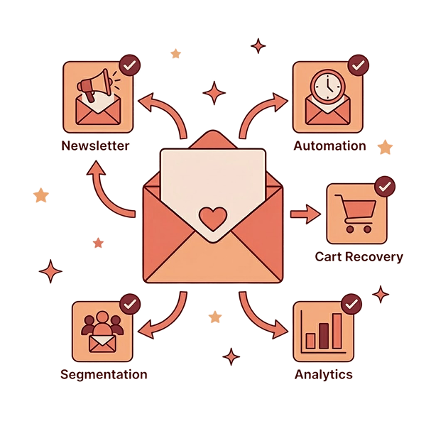
CTA- Increase your average order value quickly by creating upsell and cross-sell campaigns using UpsellWP.
Table of contents
What is the Role of UX in Upselling?
User experience (UX) encompasses all aspects of how a customer interacts with your online store, from navigation to visual design to the ease of completing tasks.
When it comes to upselling, UX plays a pivotal role. A good upsell funnel is all about what you offer, how and when you offer it. If the process is smooth and the value is clear, an upsell feels like a natural part of shopping.
UX optimization for upselling serves as the bridge that connects your upsell offer to the customer’s willingness to accept it.
For example, interrupting a customer with an irrelevant upsell pop-up in the middle of browsing creates friction (and probably frustration).
On the other hand, suggesting a relevant upgrade at checkout with one click upsells feels helpful. Effective upselling meets the customer at the right time and place in their journey.
By aligning upsell offers with intuitive UX design, you ensure customers stay engaged and see the upsell as a benefit, not a nuisance.
In short, great UX makes upsells seamless, increasing the chances that shoppers will go for that higher-tier product or extra add-on.
Now, let’s look at seven best practices to optimize UX for upselling in your eCommerce store.
7 Best Practices in UX Optimisation for Upselling
1. Clear and Compelling CTAs
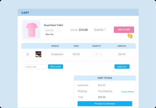
Make your upsell offers impossible to miss with clear, compelling calls-to-action (CTAs). The CTA is the button or link that invites shoppers to accept an upsell, so it needs to stand out and communicate value.
Here is how:
- Use a contrasting color and prominent placement so the CTA draws the eye (as shown in the example above, where a bright “Add to Cart” button highlights the upsell item in the cart).
- The text on your CTA should be concise and action-oriented – for instance, “Add to my order” or “Get this exclusive offer now!” is clearer and more enticing than a generic “OK” button.
Why is CTA design so important? Studies have shown that using a specific, clear CTA can increase conversion rates by 161%. In upselling, that can mean far more people clicking “yes” to your offer.
Placement matters too – a CTA positioned at a logical point in the flow (e.g. at the end of a product page or during checkout) can boost conversions by another 70%.
2. Personalized Product Recommendations
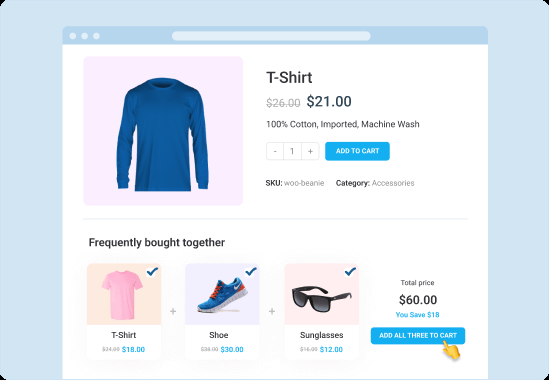
Another best practice in UX Optimization for upselling is to customize your upsell suggestions to each customer with personalized product recommendations. Shoppers are far more likely to respond to an upsell that feels relevant to their needs or interests.
In fact, Amazon attributes an estimated 35% of its revenue to its recommendation engine, which presents customers with items frequently bought together or “recommended for you”. This underscores the power of suggesting the right product to the right person.
Here is how:
- Leverage data from the customer’s behavior: browsing history, items in their cart, past purchases, etc.
- If someone is buying a smartphone, a personalized upsell might be a protective case or a pair of earbuds that other customers have bought with that phone.
- If they’re viewing a basic model of a product, you might upsell the premium version with more features.
Personalized upsells create a sense that “this is just for you”, which makes customers feel understood rather than sold to.
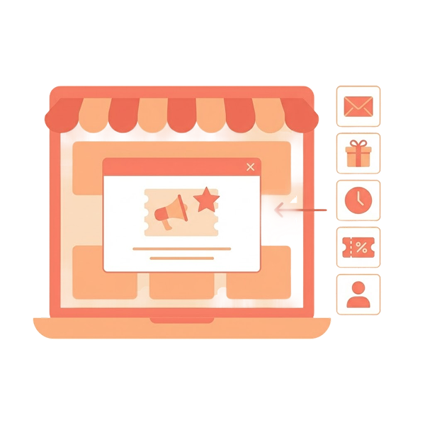
Suggest one-click upsell offers at multiple customer touchpoints using UpsellWP’s upsell campaigns.
3. Seamless Navigation Paths
Integrate upsell offers into the customer journey without disrupting it. A common mistake in upselling is forcing the user onto a detour.
For example, taking them to a different page to view an upsell product, or bombarding them with a popup at the wrong moment.
The goal instead is to present upsells along the natural navigation path so that accepting an offer feels effortless.
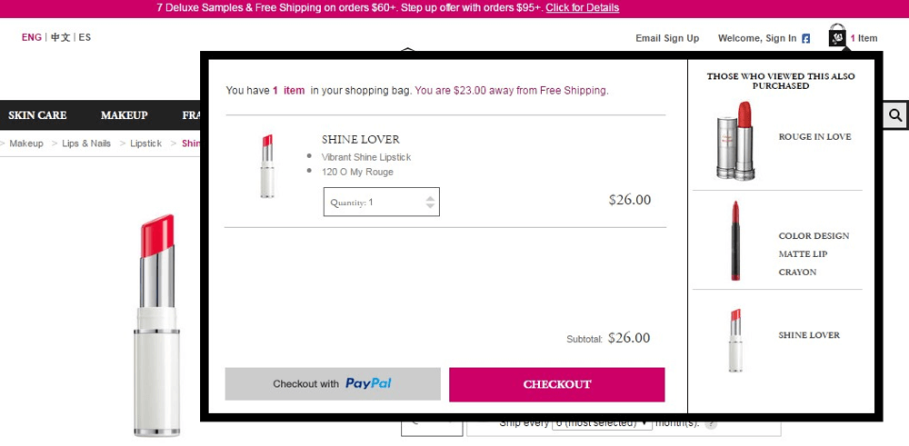
In the example image above, a mini-cart overlay shows “Those who viewed this also purchased” suggestions. The shopper can add one of those recommended items with one-click right from the cart sidebar, without ever leaving the checkout flow.
Here is how to achieve seamless navigation,
- Identify key moments in the user’s flow where an upsell would be welcome and logical.
- The optimal touchpoints for upsells: during product browsing, after adding an item to cart, at the cart or checkout page, and even on the post-purchase confirmation page.
- For example, after a shopper clicks “Add to Cart”, you might immediately show a small in-page notification: “You added X to your cart. Add Y for 20% off?”
- Use upselling techniques like slide-out panels (cart drawers), accordions, or inline expansion to embed upsell options into the current page.
Always minimize extra steps. If accepting an upsell requires navigating through multiple pages or confusing back-and-forth, many customers will skip it.
Also Read: WooCommerce Search Plugins to Boost Your Store Functionality
4. Mobile-Responsive Design
Optimize your upsell interfaces for mobile users. With the majority of online shopping traffic now coming from smartphones, mobile UX is critical.
In 2024, mobile commerce accounted for roughly 57% of all e-commerce sales worldwide, and that share is only growing.
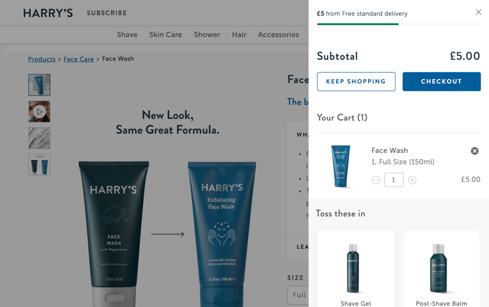
The example above illustrates a mobile-friendly cart drawer from Harry’s: notice how the upsell items (“Toss these in”) are presented in a clean, scrollable format on the side, which would collapse neatly on a phone screen.
Here is how to ensure mobile responsiveness:
- Use a responsive design approach for any upsell elements like pop-ups, banners, or sidebars.
- Test how your upsell CTA buttons look and behave on mobile – they should remain large enough to tap with a thumb and spaced far enough from other elements to avoid accidental clicks.
- It’s also wise to avoid upsell formats that can be cumbersome on mobile, like hover-dependent interactions or very large images that don’t scale down. Use simple visuals and concise text.
Performance is another aspect of UX: mobile users are often on slower connections, so ensure your upsell widgets or images are optimized for quick loading.
Remember that 57% of shoppers will abandon a site if a page (like checkout) takes more than 3 seconds to load.
5. A/B Testing for Upsell Offers
Never assume – always test and optimize your upsell strategies through A/B testing.
Even UX experts can be surprised by what upsell phrasing or design works best for a particular audience. A/B testing (or split testing) lets you experiment with different versions of an upsell and measure which one performs better.
In fact, running regular A/B tests can boost your store’s conversion rate by around 12–15% on average.
Here are some tips:
- When conducting A/B tests, change only one element at a time and gather sufficient data. For example, if you run variant A with one headline and variant B with another, make sure everything else (timing, design) is the same.
- Run the test for a long enough period or number of users to reach significance – a good rule of thumb is at least a couple of weeks or a few hundred upsell offer impressions per variant, whichever yields ~1,000+ total conversions for confidence.
- For an upsell A/B test, the primary metric is usually the upsell conversion rate – what percentage of users offered the upsell accept it for each variant.
In practice, many modern eCommerce tools (like OptiMonk, Google Optimize – now sunset but alternatives exist – or built-in features of upsell apps) can facilitate these tests without needing to code from scratch.
6. Utilizing Social Proof
Leverage social proof to make upsell offers more convincing and trustworthy.
Social proof is the psychological phenomenon where people look to others’ actions or opinions to decide their own, essentially, “if other customers liked this, maybe I will too”.
In the context of upselling, incorporating social proof can significantly increase the likelihood that a customer will say yes to an offer. This can be done by showcasing reviews, ratings, or real-time data about the upsell product.
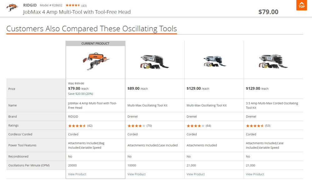
For example, in the Home Depot upsell comparison above, the table includes star ratings and number of reviews for each alternative product.
Here is several ways to inject social proof into upsells:
- Display the star rating of the upsell item and maybe a snippet of a positive review or how many customers rated it 5 stars.
- Tag your upsell item as a best seller or the most popular choice if data supports it. For instance, “Most popular upgrade!” on a premium plan upsell.
- Show messages like “Over 1,000 sold this week” or “Trending! 200 customers added this to their order today”. This creates a bandwagon effect.
One caution: social proof should be truthful and relevant. Don’t fabricate reviews or exaggerate numbers – customers can often tell, and it will backfire by damaging your credibility. Also, make sure any social proof is pertinent to the upsell.
7. Simplified Checkout Process
Streamline your checkout process to support upselling without frustration. The last thing you want is for an upsell to derail an otherwise willing customer at the finish line.
Cart abandonment rates are notoriously high (often around 70% industry-wide), and one major culprit is a complicated or lengthy checkout process.
In fact, about 17% of users abandon their carts due to a checkout process being too complex or tedious.
So, a smooth, user-friendly checkout sets the stage for customers to comfortably accept upsells either during or after checkout.
Here are some checkout UX best practices that directly tie into upsell success:
- Only ask for essential information. The faster a customer can complete their purchase, the more open they’ll be to considering an extra item.
- Requiring account signup is a conversion killer. Allow guest checkout to reduce friction.
- Include convenient payment methods (credit cards, PayPal, Apple Pay, etc.) to cater to user preference.
Another strategy to simplify checkout while still upselling is to use post-purchase upsells.
So that you don’t interrupt the checkout at all; instead, after the customer places their order, you immediately offer an upsell on the confirmation page or via email, which they can accept with one click.
Common Pitfalls and How to Avoid Them
Even with the best intentions, upselling can go awry if not executed carefully. Here are some common pitfalls eCommerce store owners face when implementing upsells – and how to avoid them with smart UX choices:
Pitfall 1: Being Too Pushy or Aggressive – If customers feel like they’re being strong-armed into buying more, it creates a negative experience. Examples include multiple pop-ups nagging for upsells, or upsell offers on every page.
Avoidance: Tone it down. Limit upsell prompts to one, at most two, well-chosen moments in the user journey. Make sure the language is helpful, not coercive. For instance, avoid phrasing like “You MUST add this!” and use gentle copy like “You might also like…” or “Upgrade for benefits?”.
Pitfall 2: Upselling Irrelevant Products – Recommending an upsell that has no connection to the customer’s interest or current purchase will confuse or annoy them. Imagine adding a laptop to your cart and getting an upsell for kitchenware – it’s jarring.
Avoidance: Use personalization and relevance (as discussed in Practice 2). Leverage your data to ensure upsells are logically related. If you don’t have enough info, at least stick to generally complementary items (phone case for a phone, toner for a printer).
Pitfall 3: Poor Timing – Even a great offer can flop if shown at the wrong moment. For example, hitting users with a premium upgrade upsell the second they land on your site (before they’ve even seen a product) is likely to be ignored or irritate them.
Avoidance: Follow the customer journey and introduce upsells at points of high intent (after add-to-cart, during checkout, etc.) If multiple upsells are relevant, don’t show them all at once; prioritize or test to find the optimal moment.
Pitfall 4: Overwhelming the Customer with Choices – Offering too many upsell options at once can lead to decision paralysis. If after adding a product to cart the customer is presented with five different add-on suggestions, they might just give up or ignore all of them.
Avoidance: Use the rule of one (or few) – try to present one upsell offer at a time. If you have a bundle of items, present it as one combined offer (“Add the matching case + charger for $X”).
By being aware of these pitfalls, you can proactively design your upsell strategy to avoid them.
Get started with UpsellWP’s customizable upsell and cross-sell campaigna to increase your average order value easily.
Conclusion
By focusing on the UX optimisation for upselling you transform upsells from a pesky sales tactic into a natural, even welcome, part of the shopping journey.
More importantly, these techniques center the customer’s needs and behaviors. The customer feels they’re getting value (not just being sold to), and you enjoy higher sales.
When a shopper adds an upsell item and feels happy about it, you know your UX optimization is on point.
So start putting these best practices into action on your site. Audit your current upsell flow, pick a few improvements from each section above, and implement them.